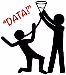
 The word “data,” by connotation, is like a sleepy-time chamomile tea. When’s the last time you heard of or saw anyone beer-bonging chamomile tea? Never. And while the default state of data inherently ‘speaks for itself,” isn’t it better to have an audience that wants to guzzle down your sweet insights rather than sip it until…zzzzzzzzz. 😴🔫 If you want colleagues and management to better digest your data, you need to spike that drink with grandma’s 180 proof hootch!
Let’s be real. Nobody wants to see your dismal black & white one’s and zero’s. People are bored enough at work. If you think you can keep someone’s attention by pointing to tables and Excel sheets, good for you. I bet you also have the personality of a wooden block. My condolences to all your wooden block children whom will never know the joy of a unicorn vomiting rainbows. Yes, keeping an audience’s attention is necessary (even if it means including images of prismatic-belching fantasy creatures).

But attention is just the start. You need to communicate your message too. By the way, my definition of ‘communication’ has two parts:
1) sending AND 2) receiving information.
It must be BOTH! Do you know why you can’t communicate with a brick wall? Because you get nothing back! It’s one way. No return. Also because you know, it’s a brick wall.
“But people love to hear me talk. I’ve got a silver tongue and cadence for days…”
Even if that was true, you’re working against science. The brain can process images in less than 15 milliseconds. Combine that with the facts that:
1.) the majority of humans are visual learners (~65%),
2.) both long- and short-term memory retention is improved with concepts accompanied by visuals, and
3.) visual cues are proven to access emotion while increasing comprehension
and failing to deliver your work in such a way is a major missed opportunity. No matter how many smooth jazz voice-overs you’ve done.
So how do I communicate my work correctly?
Looking for signs of life is a good start. But to ensure you’re communicating well, you should be receiving cues of understanding and engagement. That’s the formula to follow if you want increase your value as an employee. To elevate your chances of promotion, you should:
Summarize and share your work VISUALLY to maximize interest, understanding, and engagement. Share on X
Pictures are worth a 1000 words so give ‘em 1000 pictures. When your peers (and boss) can tag you as “the guy/gal who explains complicated shit easy-like,” who do you think they will go to when needing help or to take on a high value project? That alone will propel you into a leadership mentality which in turn can prepare you for your next big opportunity. Visualizing the results of your work will also naturally inspire confidence from your audience. Remember:
People believe in things they can see much easier than things they hear.
Take your data visualization to the next level by infusing a bit of emotion and your peeps will be hanging on every insight. Just like any good book, you can captivate an audience by telling a story. What is the story of your data?
Below are several ways you can easily communicate your concepts and contributions. Think about how you could apply each of these to your next project or task, no matter how small. By thinking visually, you’ll be deepening the connection to your audience and raising your stock as an intelligent communicator.
- Charts & Graphs
- Bar, Pie, Line, Scatter, Flow, etc.
- Mind Mapping
- Brainstorming & Collaboration
- Venn Diagrams
- (but you better make them sexy)
- Infographics
- White-Boarding
- Decision Trees
- Timelines
- Ratings
- Emoji’s
Now prove I’m not speaking to a brick wall by sharing your thoughts and comments below!
To learn more ways you can get promoted continue the series here: “Simply Master These 4 Areas To Get Promoted”
And if you haven’t already, signup for our Newsletter Underground and get our FREE Guide: “5 Things to Say to Your Boss Tomorrow to Get Noticed”


